
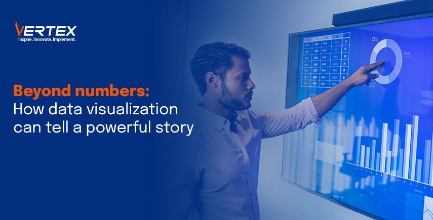
Beyond Numbers: How data visualization can tell a powerful story
Numbers might confuse many, but pictures don’t. When discussing data, a lot of people become apprehensive, thinking it’s akin to rocket science. However, with the help of data visualization, the entire process becomes easier. According to MIT, 90% of the information transmitted to our brains is visual. Through the practice of data visualization, one can transform ordinary pieces of data into visual objects such as maps, graphs, or Venn diagrams.
Details about data visualisation
One of the phases in the data science process is data visualization, which asserts that conclusions can only be drawn from data that has been gathered, processed, and modeled. Additionally, data visualization is a component of the larger field of data presentation architecture (DPA), which aims to efficiently identify, locate, manipulate, format, and deliver data.
Visualization is essential for advanced analytics. It becomes crucial to visualize the outputs when a data scientist is developing sophisticated machine learning (ML) or predictive analytics algorithms to track outcomes and ensure the models are operating as intended. This is because complex algorithm visualizations are typically easier to understand than their numerical results.
Benefits of data visualization
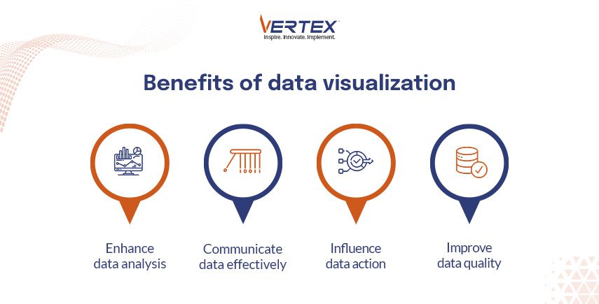
1. Enhance data analysis: Enhancing your data analysis and interpretation is a significant advantage of data visualization. A variety of visualization techniques, including histograms, scatter plots, heat maps, and treemaps, can help uncover distributions, patterns, and correlations in your data that might otherwise go undetected or unnoticed. Additionally, data visualization allows you to zoom into specifics or zoom out to the big picture while exploring various facets and viewpoints of your data. This helps to get more profound data insights.
2. Communicate data effectively: Effective data communication to your audience is important, whether it is your team, your clients, or your stakeholders. You can highlight the most important points, accentuate the primary messages, and use visual elements such as colors, shapes, icons, and labels to tell an engaging story with your data. Additionally, you can use data visualization to make technical or complicated data easier to understand and more interesting for your audience. In this way, you can communicate your data effectively and clearly.
3. Influence data action: The ability of data visualization to influence your actions and results is a significant advantage. You can persuade your audience to act based on your data by using data visualization to both inform and educate them. Data visualization can illustrate the advantages, disadvantages, opportunities, and difficulties associated with various options and suggest the best course of action. Additionally, data visualization can track and evaluate the outcomes of your actions and make necessary adjustments. By doing this, you can maximize the use of data in your decision-making and achieve your objectives. The Wharton School of Business discovered that when visuals were included, the percentage of audience members who were persuaded increased to over two-thirds from just half in a verbal presentation.
4. Improve data quality: One of the benefits of data visualization is that it can help you improve the quality and accuracy of your data. By visualizing your data, you can spot errors, outliers, inconsistencies, and missing values more easily, and correct them before they affect your analysis. You can also use data visualization to validate your assumptions, test your hypotheses, and compare different scenarios. This way, you can ensure that your data is reliable and relevant for your decision-making.
How data visualisation can tell a powerful story?
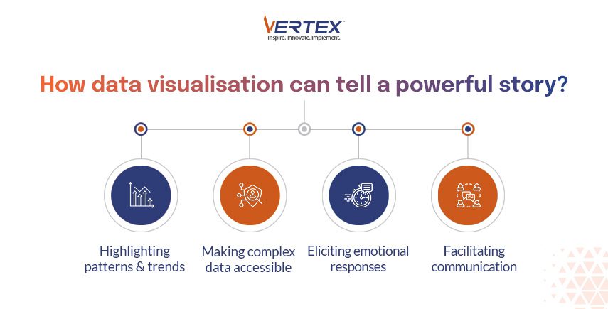
1. Highlighting patterns and trends: Data visualization can reveal patterns and trends in data that might not be immediately apparent from raw numbers alone. Whether it’s an upward trajectory in sales over time or a correlation between variables, visualizations make these insights clear and compelling.
2. Making complex data accessible: Complex datasets can be difficult to understand at a glance. Visualizations simplify complexity by presenting data in a format that is easy to interpret, allowing audiences to grasp key insights quickly. Additionally, for assistance with data management, you can opt for the services of Vertex.
3. Eliciting emotional responses: Well-crafted visualizations have the power to evoke emotions and provoke reactions. Whether it’s shock at seeing the scale of a problem or inspiration from observing progress over time, visualizations can engage audiences on a deeper level than raw data alone.
4. Facilitating communication: Visualizations serve as a universal language that transcends barriers such as language or technical expertise. They enable effective communication of complex ideas and concepts to diverse audiences, fostering understanding and collaboration.
Conclusion
In conclusion, data visualization is a powerful tool that can transform complex data sets into easily digestible narratives. By leveraging the human brain’s natural affinity for visual information, data visualization empowers us to uncover patterns, enhance communication, and ultimately, make data-driven decisions.
Vertex offers a comprehensive suite of data management services that can help you clean, organize, and prepare your data for visualization. With Vertex by your side, you can unlock the hidden stories within your data and transform them into actionable insights.
Contact Vertex today to learn more about how our data management solutions can empower your data visualization journey.
Recent Blogs

10 April, 2026

3 April, 2026

27 March, 2026

20 March, 2026

13 March, 2026

6 March, 2026

20 February, 2026

13 February, 2026
Recent News

26 February, 2026

6 December, 2025

1 August, 2025

2 February, 2025

14 November, 2024

4 November, 2024

1 August, 2024

6 March, 2024
